How to create a graph
Example Teacher script
As discussed in a previous lesson, there are a number of different types of graphs including bar graphs, picture graphs, histograms and many more. We are going to look at each of these different types of graphs to determine what information we need and how we go about creating that particular type of graph. With all graphs, there is certain information that has to be collected, regardless of the type of graph. To get this information we need to ask data questions. We might need to know:
- A title
- What is it that you are gathering (ways of coming to school, eye colour, country of birth)?
- What questions do we ask? For example, how many people have participated in your survey?
- How can computers help us show this information?
- How are you going to represent this information on a graph? What software would it be best to use?
We will now look at each of the different types of graphs and work through an example together.
Bar Graph
A bar graph contains information that we need to gather in order to fill out the information. For this example, we are going to use the online bar graph making tool called Create a Graph. Here is a picture of a graph not yet filled out. (Show students the graph on the Interactive whiteboard IWB)
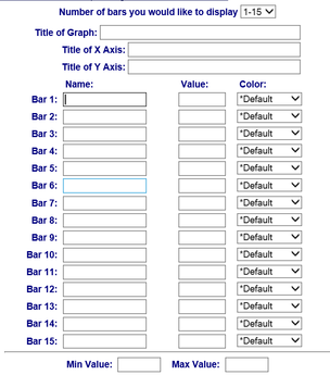
Example teacher script
As you can see there is some important information to enter. We will use a pretend situation in which we asked students how they get to school to complete this graph. Of 30 students, 13 came by car, 7 walked, 6 rode a bike and 4 caught the bus. Here is the information that will be entered.
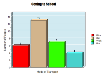
Title - Getting to School
X Axis (Always the horizontal axis and contains what you were researching) - Mode of Transport.
Y Axis (Always the vertical axis and contains the numbers the numbers that you gathered) - Number of people
Bar 1 - Bike. The value for this one is 6
Bar 2 - Car. The value for this one is 13
Bar 3 - Walk. The value for this one is 7
Bar 4 - Bus. The value for this one is 4
Min and Max Value - We will always start at a minimum of 0. Because we have 13 people by car, we will set the maximum for this one slightly higher at 15.
Enter this information into the system and press create graph. We can create a bar graph using online tools like this or through drawing it ourselves. Here is a picture of a completed Bar graph. Notice how the number represented by the bar aligns perfectly with the equivalent number on the Y axis.
Teacher notes: Check for student understanding of terminology and explicitly teach subject specific vocabulary if required. Monitor for student engagement and participation.
As you can see there is some important information to enter. We will use a pretend situation in which we asked students how they get to school to complete this graph. Of 30 students, 13 came by car, 7 walked, 6 rode a bike and 4 caught the bus. Here is the information that will be entered.
Title - Getting to School
X Axis (Always the horizontal axis and contains what you were researching) - Mode of Transport.
Y Axis (Always the vertical axis and contains the numbers the numbers that you gathered) - Number of people
Bar 1 - Bike. The value for this one is 6
Bar 2 - Car. The value for this one is 13
Bar 3 - Walk. The value for this one is 7
Bar 4 - Bus. The value for this one is 4
Min and Max Value - We will always start at a minimum of 0. Because we have 13 people by car, we will set the maximum for this one slightly higher at 15.
Enter this information into the system and press create graph. We can create a bar graph using online tools like this or through drawing it ourselves. Here is a picture of a completed Bar graph. Notice how the number represented by the bar aligns perfectly with the equivalent number on the Y axis.
Teacher notes: Check for student understanding of terminology and explicitly teach subject specific vocabulary if required. Monitor for student engagement and participation.
Picture Graph
Example teacher script:
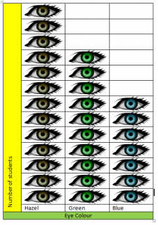
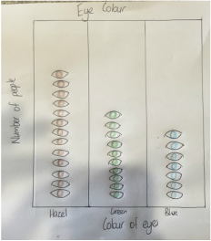
A picture graph is similar to a bar graph, but instead of using bars to represent values, we place pictures, drawings or stickers into the graph. If we were to create a picture graph using the eye colour of students in the class, it may work like this. If out of 30 students in the class, 13 had hazel eyes, 10 had green eyes and 7 had blue eyes, we could represent this easily with a graph. First we would need to gather information.
Title - Eye Colour
X Axis (Always the horizontal axis and contains what you were researching) - Colour of eyes
Y Axis (Always the vertical axis and contains the numbers the numbers that you gathered) - Number of people
Bar 1 - Hazel. The value for this one is 13
Bar 2 - Green. The value for this one is 10
Bar 3 - Blue. The value for this one is 7
We do not have to worry about a minimum and maximum value for this one as we will draw the exact amount. Here is a picture of a completed picture graph. Notice how the pictures match what were documenting (coloured eyes that match each bar). There is the exact number that we are representing, just in drawings. Picture graphs represent numbers in an interesting way.
Histogram
A histogram is very similar to a Bar Graph but instead of representing the amount of a particular value (How you got to school), a histogram represents numerical values. Often they are used to represent large values. Here is an example of a histogram.
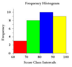
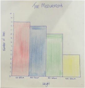
Lets create a histogram together. If we went and measured the height of 40 newly growing trees in a paddock. And found that of the 40 trees we measured 13 measured between 100cm and 200cm, 12 measured between 200cm and 300cm, 10 measured between 300cm and 400cm and 5 measured between 400cm and 500cm. (Use a metre ruler to show students what this height would look like). To represent this information, we must determine what goes on each axis of our histogram. Frequency will be the Y axis while the tree height will be the X axis. As our measurements had a minimum of between 100cm and 200cm, this will be our lowest value and go on the X axis in the first column, with the other 4 potential heights in the next three columns. On the Y axis will be the numbers between 0-15 as our highest is 13, but it is best to make it slightly bigger. Ensure that there is a heading and that each axis is labelled. What do we put on the x axis? What goes on the y axis? (Complete the histogram together using the online tool). After this activity, show the students a hand drawn histogram. Here is a picture of a completed histogram of tree measurements using that same information. Now you see if you can draw one using the same information.
Now that you have looked at each of the different types of graphs we will be working with and seen some of the resources that you can use to make them, we are now going to go onto the next page where you can complete some graphs together.
